If you know, you know.
Not too long ago, we decided it was time to refresh our brand so we took a step back to look at ourselves as a company; assessing where we started, where we are now and where we want to be. We came to the conclusion that our current logo no longer reflected who we are as a business.
That’s not to say, the logo didn’t do us well! At the time it was a clever and fun logo that made had us standing out from the crowd and could be a conversation starter, however, as a brand we felt had outgrown the style and were due for a change.

Refresh or rebrand?
Before embarking on such a task, it was important for us to ask ourselves what the goal would be for the new logo and whether we need to rebrand or refresh our look.
You may be thinking, aren’t they the same thing? And we wouldn’t blame you! Both options involve evaluating your business and most often include new logos. The key difference between the two is how you want to be perceived by the outside world.
A brand refresh is used more to remain modern and up to date as a company but keep the values and image you have already created for yourselves. Whereas a rebrand is a transformation process and therefore best used to change the perception of the company, creating a blank slate.
Our brand refresh
With the above in mind, we decided a brand refresh was required, as we still have the same company values but not a logo that reflected our more modern vision.
We started the journey with a brainstorming session, asking ourselves why now, what is our story, what is our mission and what we wanted for our brand. To which we found it all boiled down to one key piece of information; we are proud of what we do and want our work and team to speak for itself.
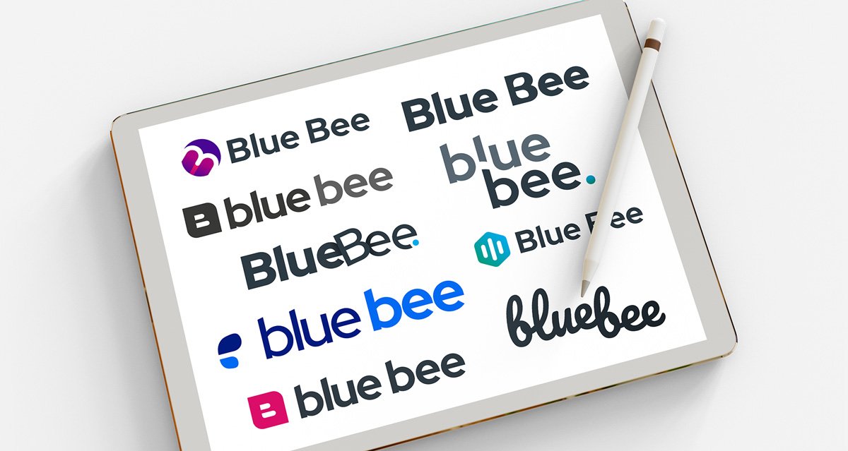
The design process
Our team of designers then got to work, taking in all the keywords from the brief which included things like; minimal, strong, dependable, honest, trustworthy, creative and approachable.
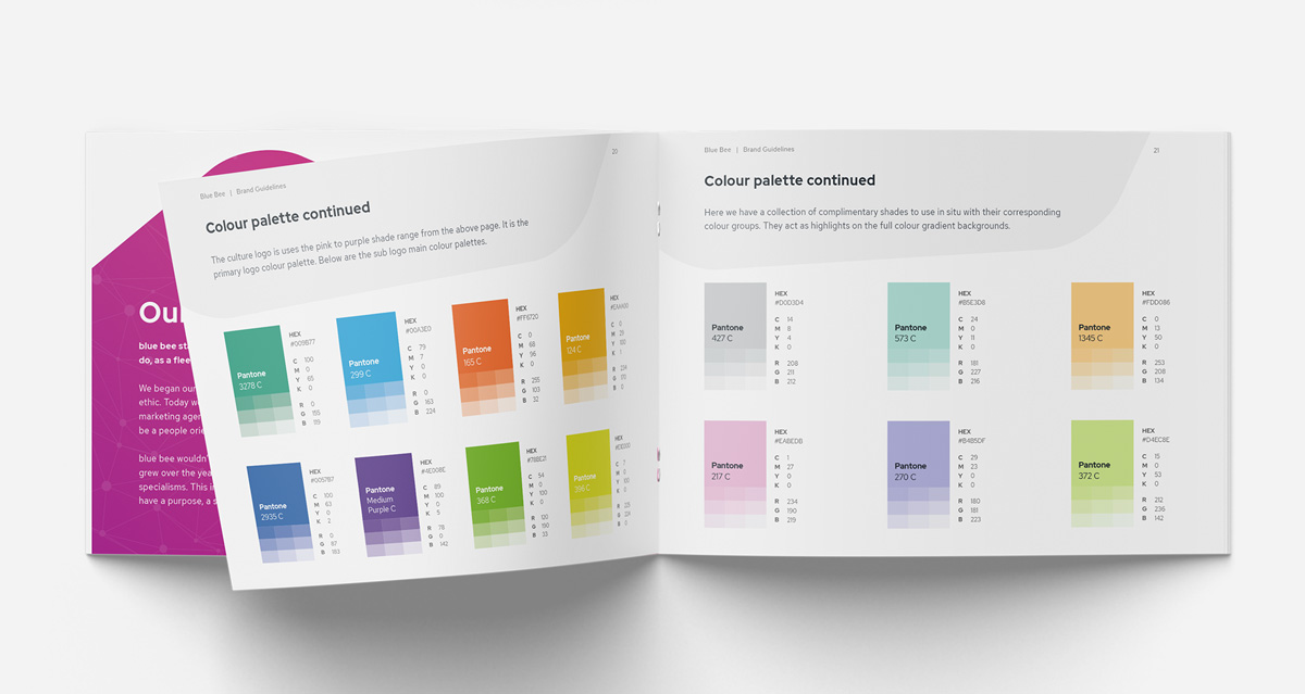
We liked that the current logo was recognisable and simple but felt it could be more subtle and it didn’t reflect our position within our industry as well anymore. We had already established a new colour scheme in our social presence and website and so we wanted to bring those colours into the brand for a cohesive and universal style.
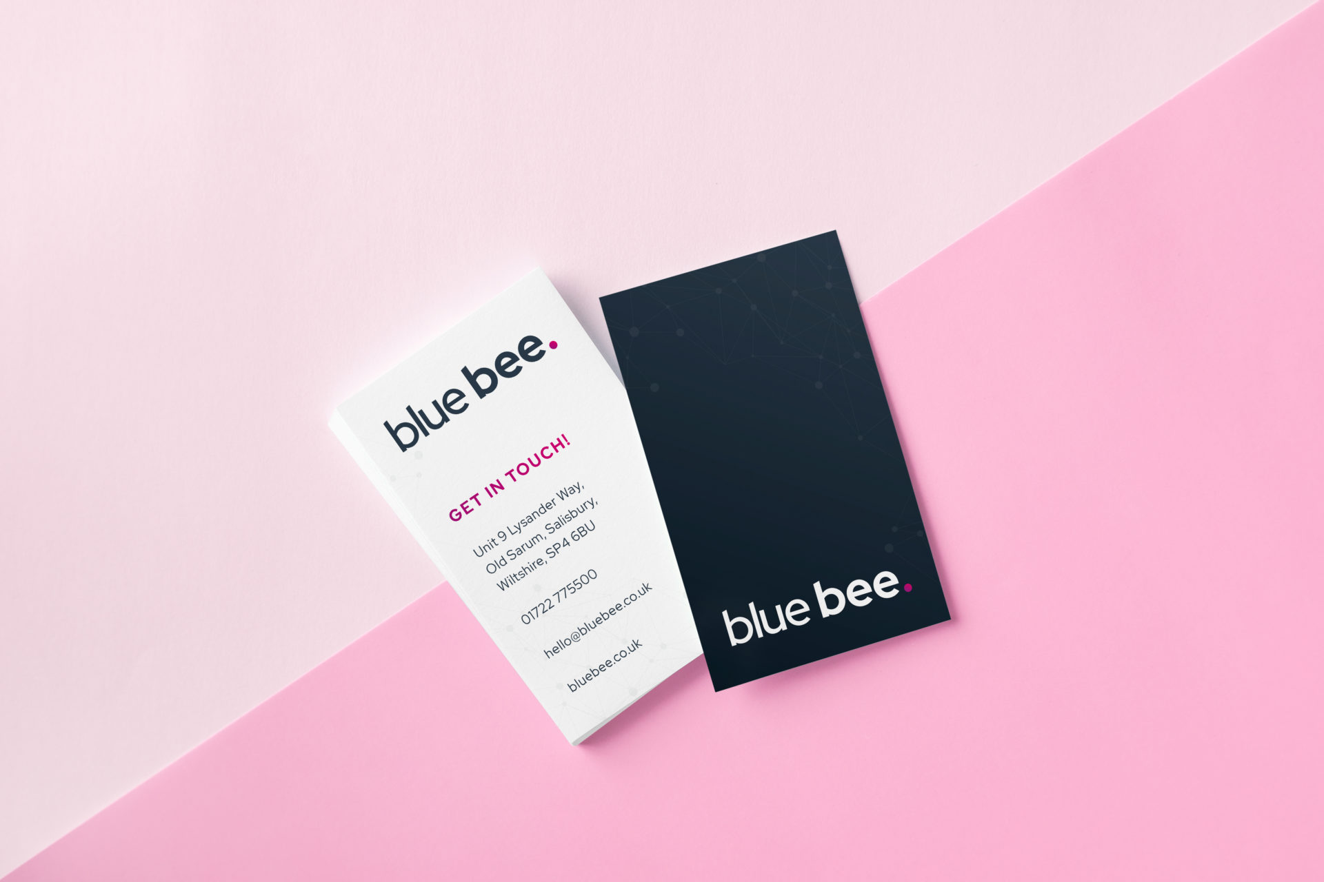
The final product
…and here we are!
After lots of hard work, we have our new brand. We kept the logo down a typography route, allowing our work to stand out for itself. We now use a lowercase type to reflect our friendly and approachable nature.
Additionally, we use a two-toned bold font-weight to give strong and dependable connotations. Lastly, we utilise the coloured full stop at the end to subtly showcase honesty and that we will tell it like it is, as well as being able to use it to pull through our designated colour schemes we use for the areas of our business.