Sparkles Ltd
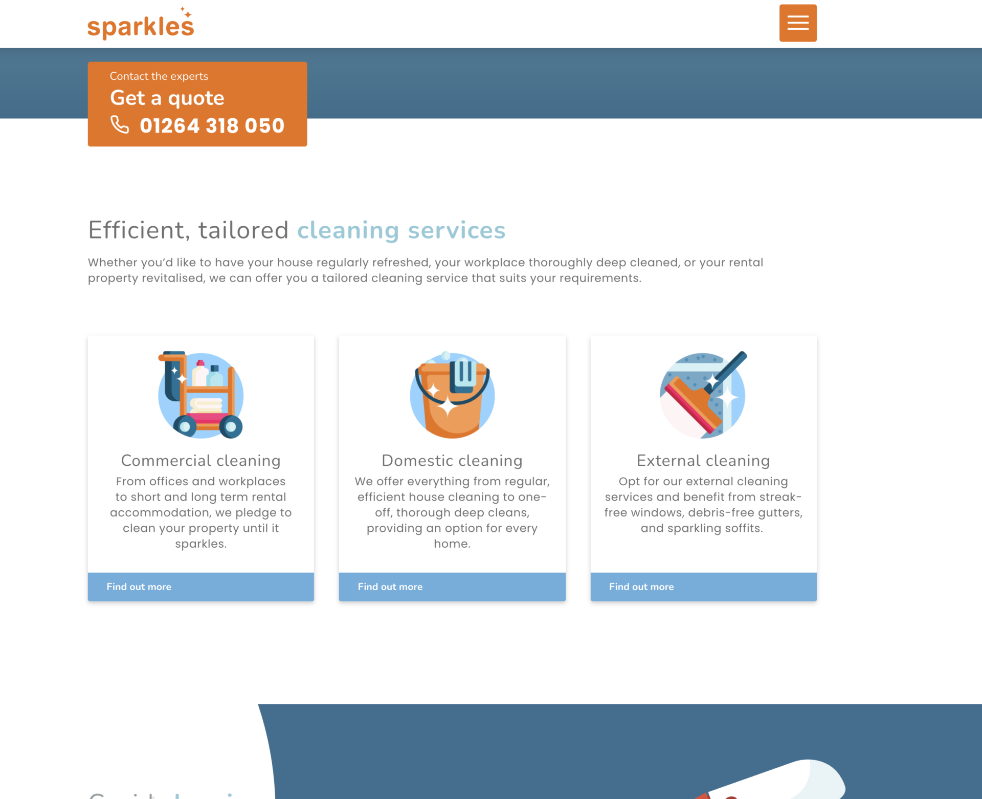
Efficient, tailored domestic and commercial cleaning services
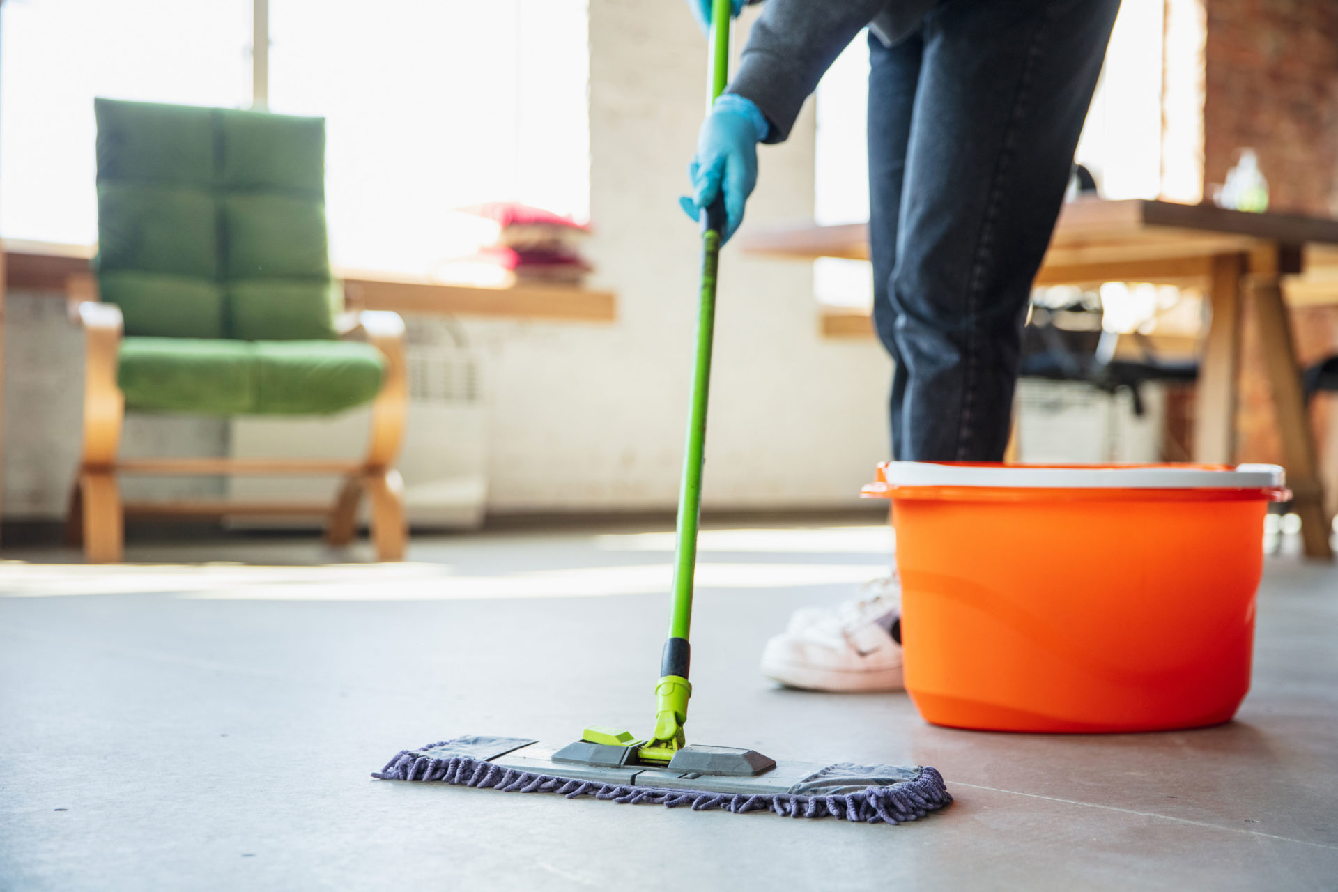
Sparkles are an expanding domestic and commercial cleaning service based in rural Hampshire, working at a range of locations across the South of England.
They offer tailored cleaning services a strong focus on taking care of customers properties and leaving them sparklingly clean. Sparkles take pride in cleaning a range of properties from people’s homes and tenancy properties to commercial buildings.
Sparkles overview
Sparkles had seen large growth in business over the last couple of years, however, their website was dated and didn’t showcase the company as well as they wanted so they came to Blue Bee for help.
They originally started with just two people, but have now expanded to a much larger team, and in order to explore larger and more complex contracts they needed a website that reflected the Sparkles services accurately. It needed to increase exposure, provide a strong visual identity and better position them in the digital space to expand their business. Which, given the today’s climate, is more important than ever.
What we delivered
Our Approach
When Sparkles came to us their website was built to a basic WordPress template, hadn’t been updated in a long time and didn’t allow them to demonstrate how far their business has grown since it was built.
We began by holding a project scoping meeting with the client. This is part of our discovery phase and it allows us to learn and understand as much as we can about their business, their current frustrations and their future goals for the website. Having this wide range of knowledge from the beginning allowed us to develop the perfect website for the client that meets their growing needs.
When putting our plan together the user was considered from the start, allowing the website to naturally guide the user through the services to then getting in touch with Sparkles, the aim result being an increase of conversions for the client.
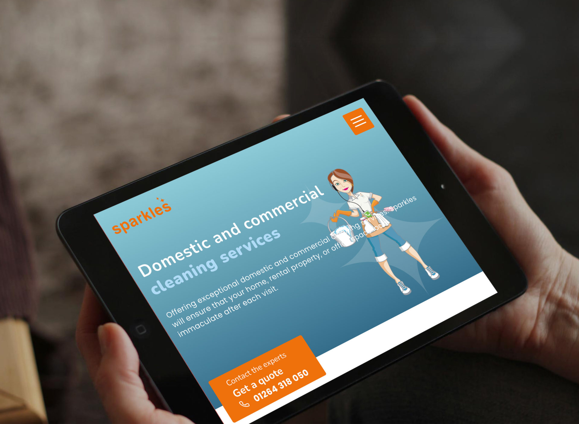
Branding refresh & design
The Sparkles team didn’t want to lose the recognition their current logo had but felt their overall branding needed to be modernised, being professional while keeping their fun personality.
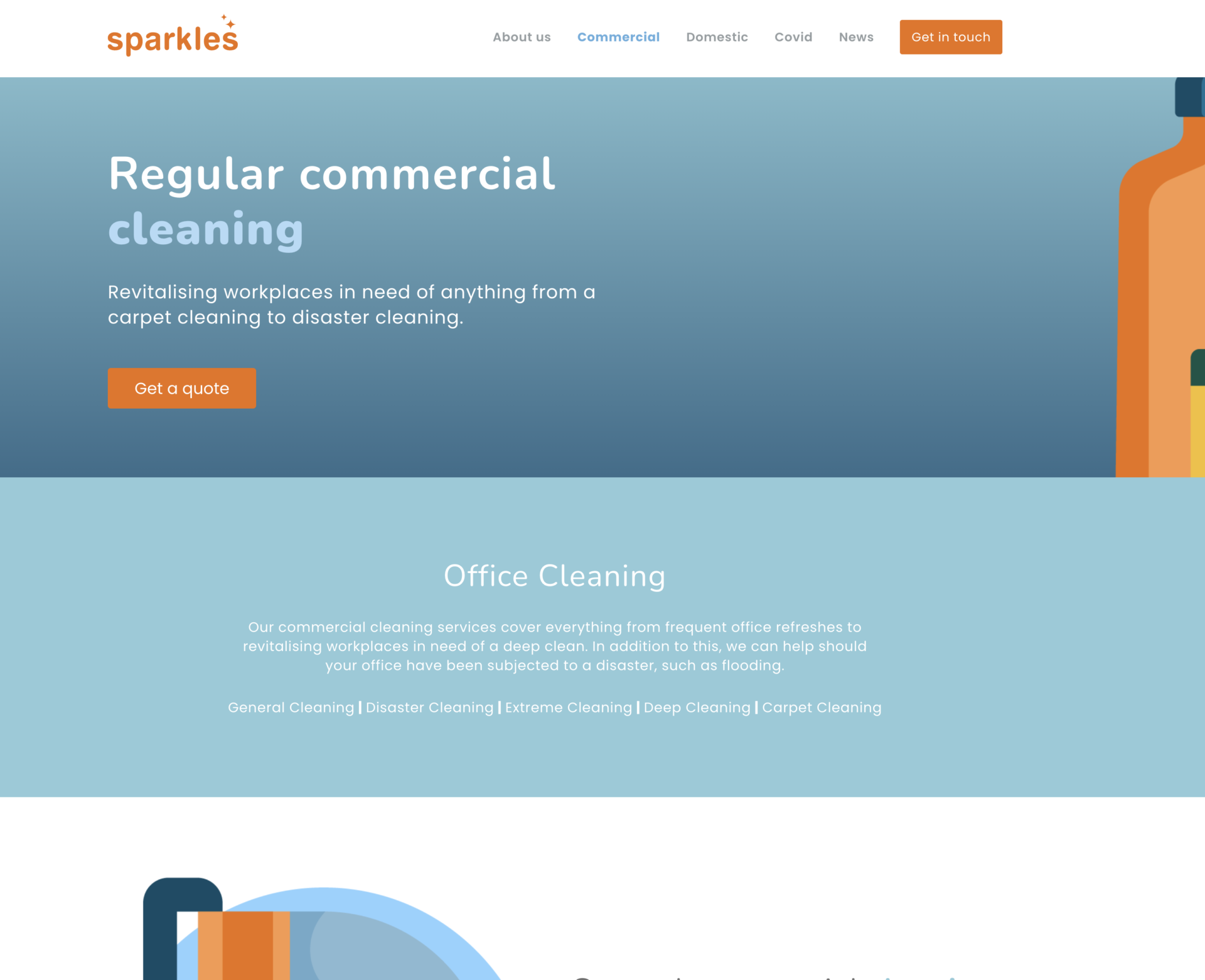
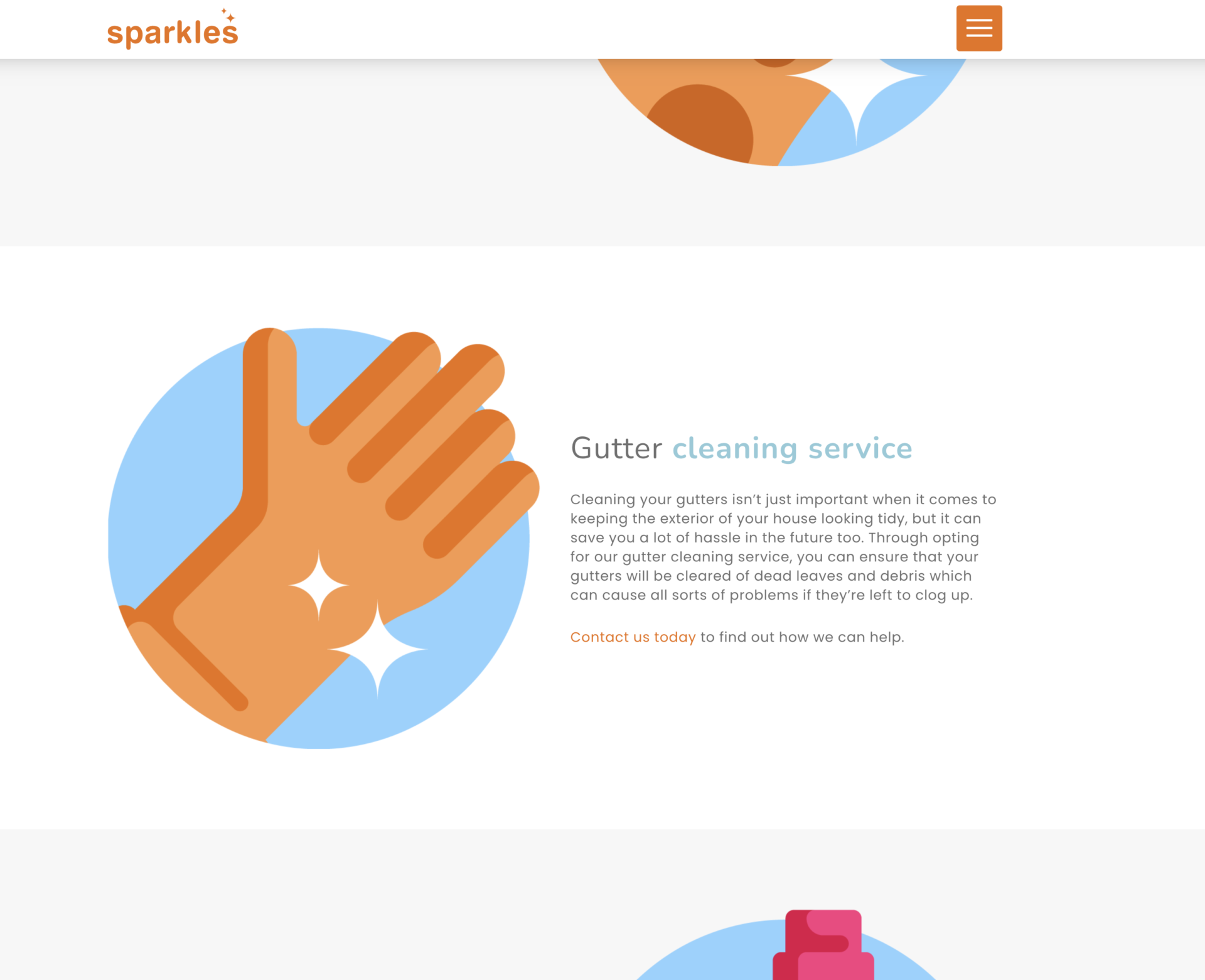
Our main aim was to not change the bold orange logo but develop the colours and other visual identity around it instead. Choosing cool colours such as blue and grey allowed us to use their contrasting orange brand colour to create impact and strong call to actions.
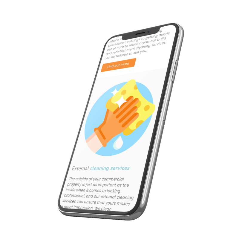
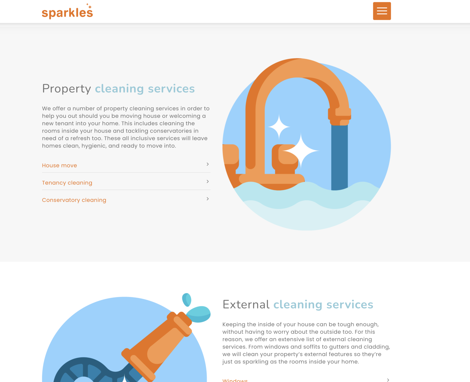
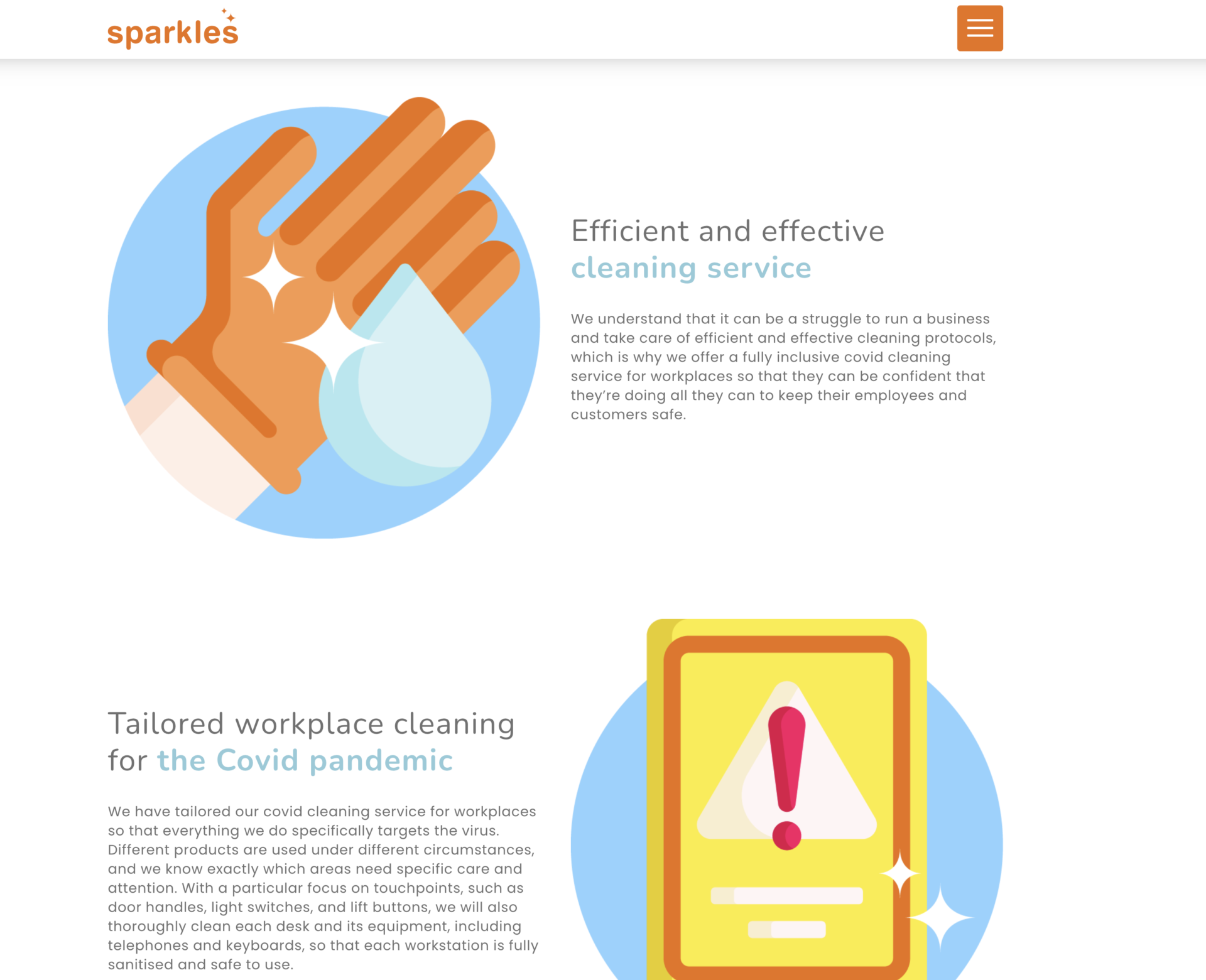
Using bespoke illustrations allowed us to create a modern but professional look and feel and whilst maintaining their fun and friendly brand. Isolating the sparkle shapes from their logo and using them within graphics creates brand consistency and recognition throughout the website. Having such strong branded graphics created a visually eye-catching user experience, ensuring that it was memorable.
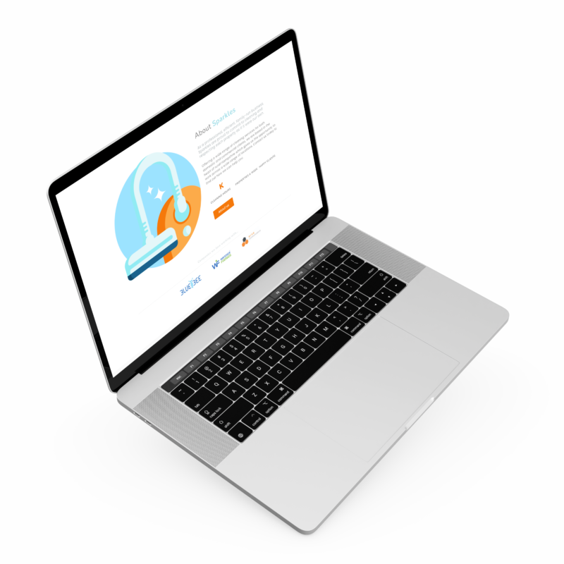
An SEO-ready website
As well as focusing on creating a modern, user-friendly and responsive design, we always build our websites with SEO in mind. One of the keys to creating a website that’s SEO-ready is creating a clear navigation, as well as content that helps direct visitors straight to the most relevant pages for them, and this is what we did with Sparkles.
Once the new website development was completed, we carried out thorough testing as part of our process to ensure that the website responded well across all devices and browsers, functioned correctly with no broken links or errors and set up the tools required to implement use of their site within their future digital marketing campaigns. All of these components working together have created a modern, bespoke website that is optimised to appear in online searches and result to lead generation.
Website Design
Related Projects
Our accreditations