Summers Insurance
Offering a fantastic variety of insurance products to a number of potential audiences
A 3-generational insurance brokers with over 40 years of valued experience, Summers Insurance offer a range of products suitable for individuals, businesses, and charities.
From must have travel insurance to more niche agricultural options, this company covers all bases and they are trusted by their customers to offer the best insurance products available.
Summers Insurance offer a personal touch when it comes to their customers and always work hard to understand the individual needs and requirements of those who approach them. Through communicating in an effective way, Summers Insurance remove complicated jargon and can find the best solution for any client’s needs.
Summers Insurance Overview
Summers Insurance have been around for 40 years and felt that their brand and website needed a refresh. They wanted their new website to break the mould and stand out from other insurance websites whilst remaining professional and corporate, a challenge that our team at BlueBee were very happy to accept!
In addition to a new website, Summers Insurance required updated branding, including a logo and refreshed brand colours, giving us the chance to get creative and build a brand that the company really loved.
What we delivered

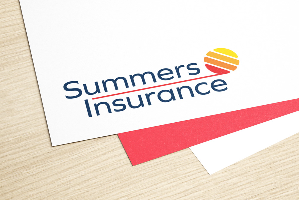
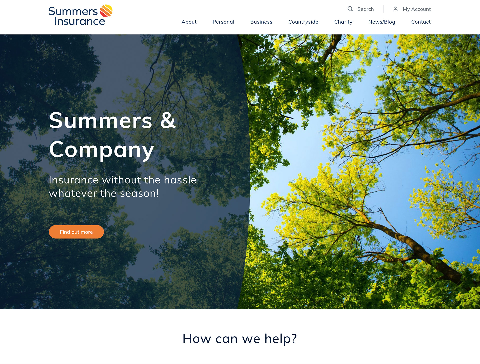
New branding
Branding is very important when determining a company’s character, and as Summers Insurance have 40 years of experience behind them it was important to strike a balance between modern and corporate. The company wanted summery imagery to complement their name, so we decided to opt for a fresh and bright colour palette to match.
Choosing a vibrant orange for the logo and CTAs, we used complementary blue, green, yellow, and red tones throughout the site to give it an inviting feel. The font we chose for the new Summers Insurance logo has a corporate edge and this has been paired with a sun design to add some character.
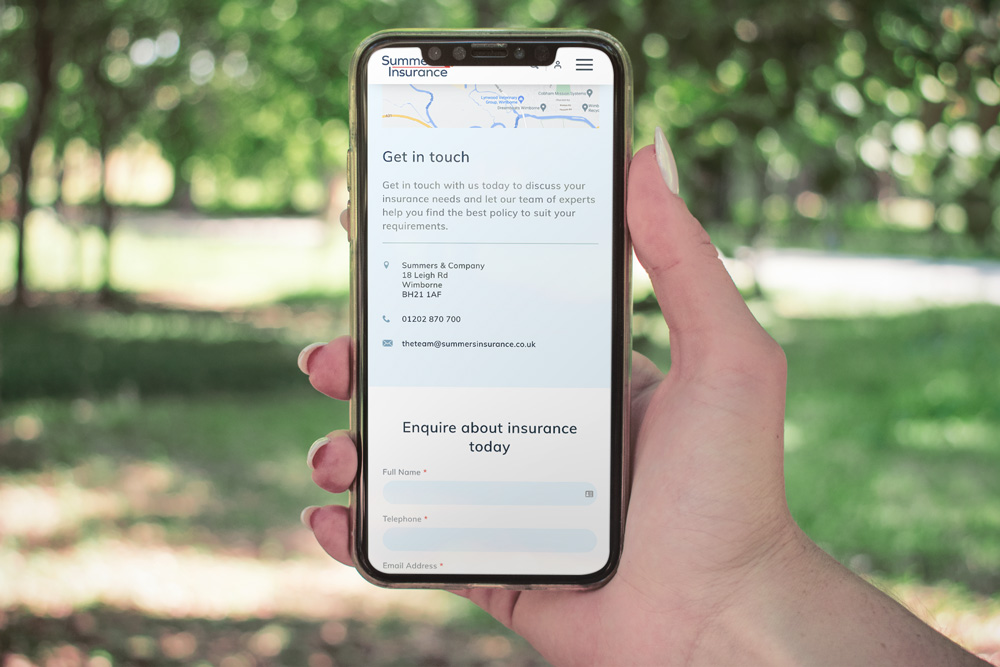
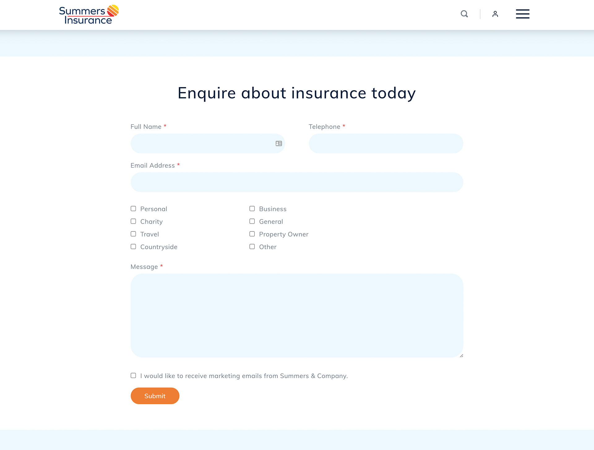
A user-friendly design
The new Summers Insurance website has been designed with users in mind and boasts a clear navigation with bold CTAs.
The combination of these two design features means that customers can easily find what they’re looking for and won’t become frustrated when navigating around the site.
We also included a simple enquiry form to make it very easy for potential customers to send their questions and submit their contact details.
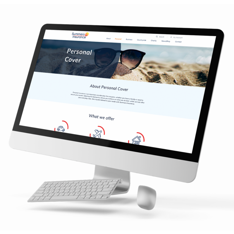
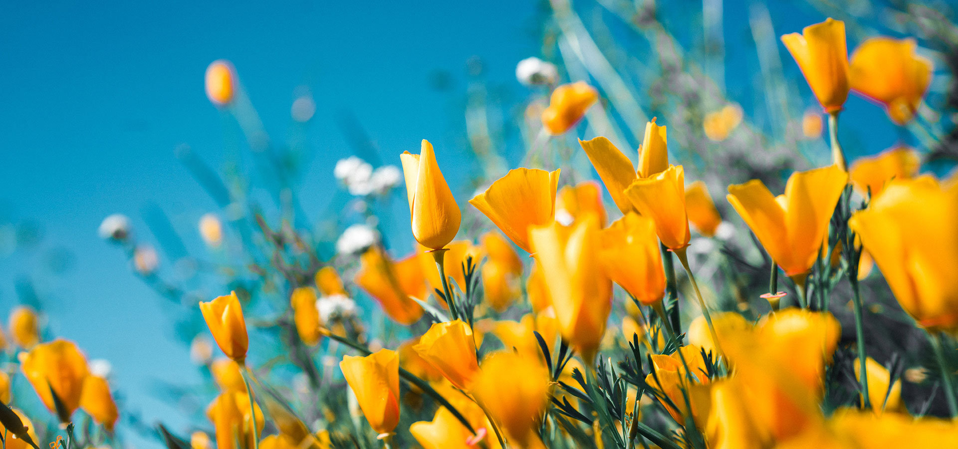
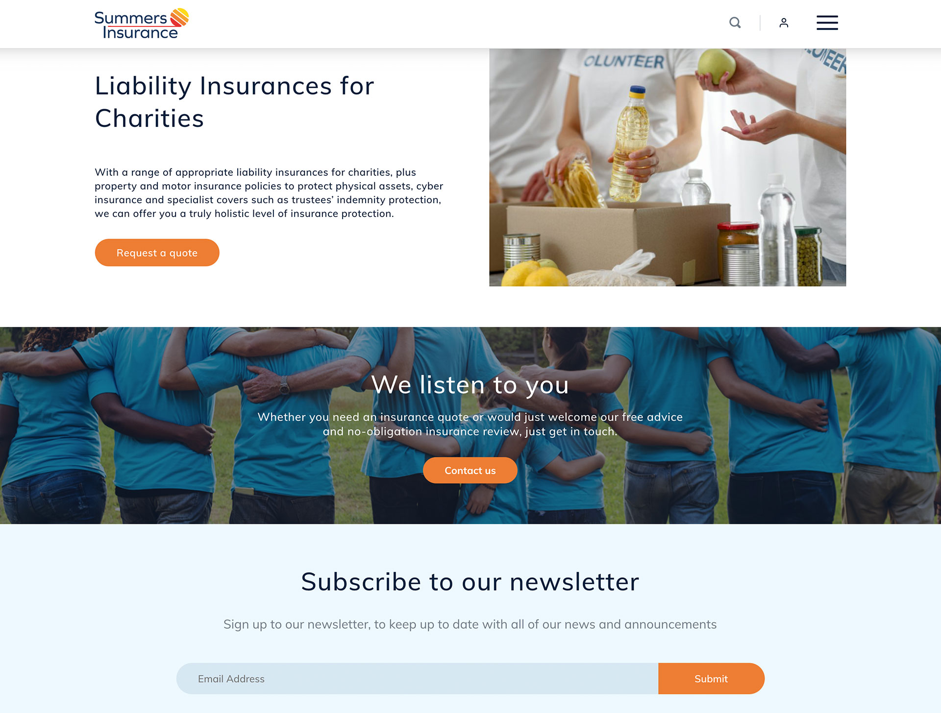
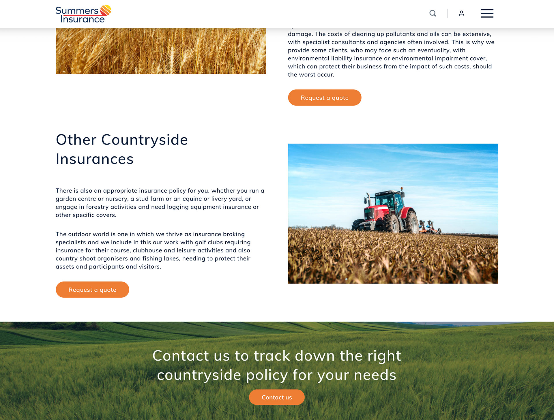
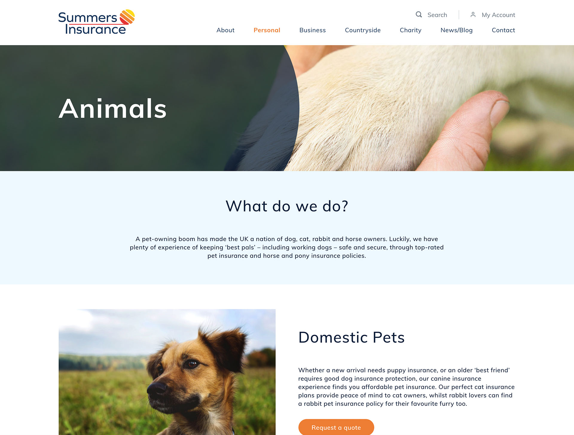
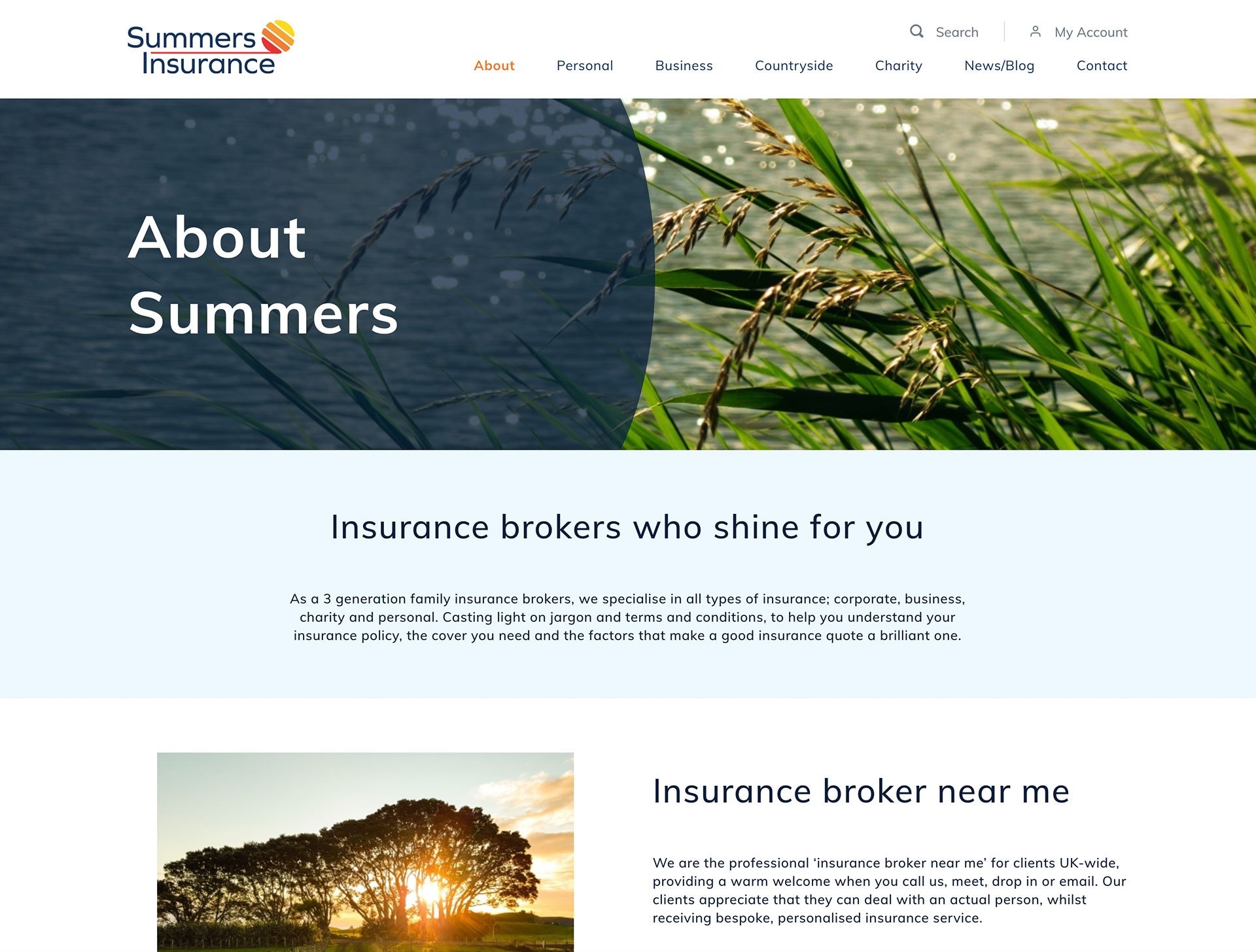
Strong imagery
To keep with the summer theme, imagery was chosen that reflected this season and perfectly complemented the newly chosen brand colours.
This imagery gives the site a fresh and approachable look which will encourage potential customers to look around and find the information that’s relevant to them. We also included fun icons to draw the eye, and these also break up the pages and stop the website from being too text heavy.
Examples of what we did
Related Projects
Our accreditations