Octopus Plumbing & Heating
Small yet reliable, local plumbing and heating business
Octopus Plumbing & Heating are a small yet reliable plumbing and heating business covering various aspects of plumbing and heating.
They believe communication, integrity and reliability is the key to a successful business relationship and go above and beyond to ensure their clients get everything they need.
Octopus Plumbing Overview
Octopus Plumbing are a local firm, specialising in all aspects of plumbing and heating. This was to be reflected in their logo, with a many-armed approach to the services and skills provided.
The character of the octopus needed to be friendly and fun and look great on the side of the company vehicle. The requirement for a bright and eye-catching cartoon mascot for a local plumbing firm set all of the arms of our illustrator into action.
What we delivered
Business logo with (many) twists
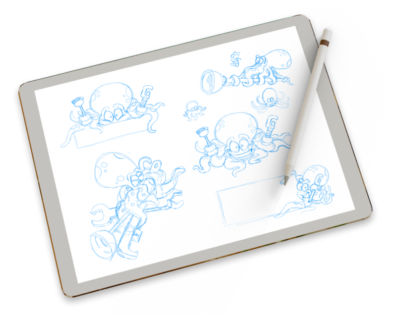
The brief from the client was to create a logo that was bright, visually exciting and simply couldn’t be missed and with a name like Octopus, we already had big idea’s flowing! Originally the client was going to go down a more stereotypical route for the business name but decided to go against the grain and chose a name to stand out from the crowd.
Our illustrator leapt straight into action, presenting the client with a range of different initial pencils sketches and ideas. This gave them an idea of how the character might look, it’s physical shape and how it might be interacting with the text that would sit alongside. A series of possible typefaces were also selected at this stage.
Humour wasn’t high up on the list for requirements, but it was agreed that it would be amusing and memorable to have the octopus wresting with a variety of plumbing and maintenance tools.
Many arms make a logo work
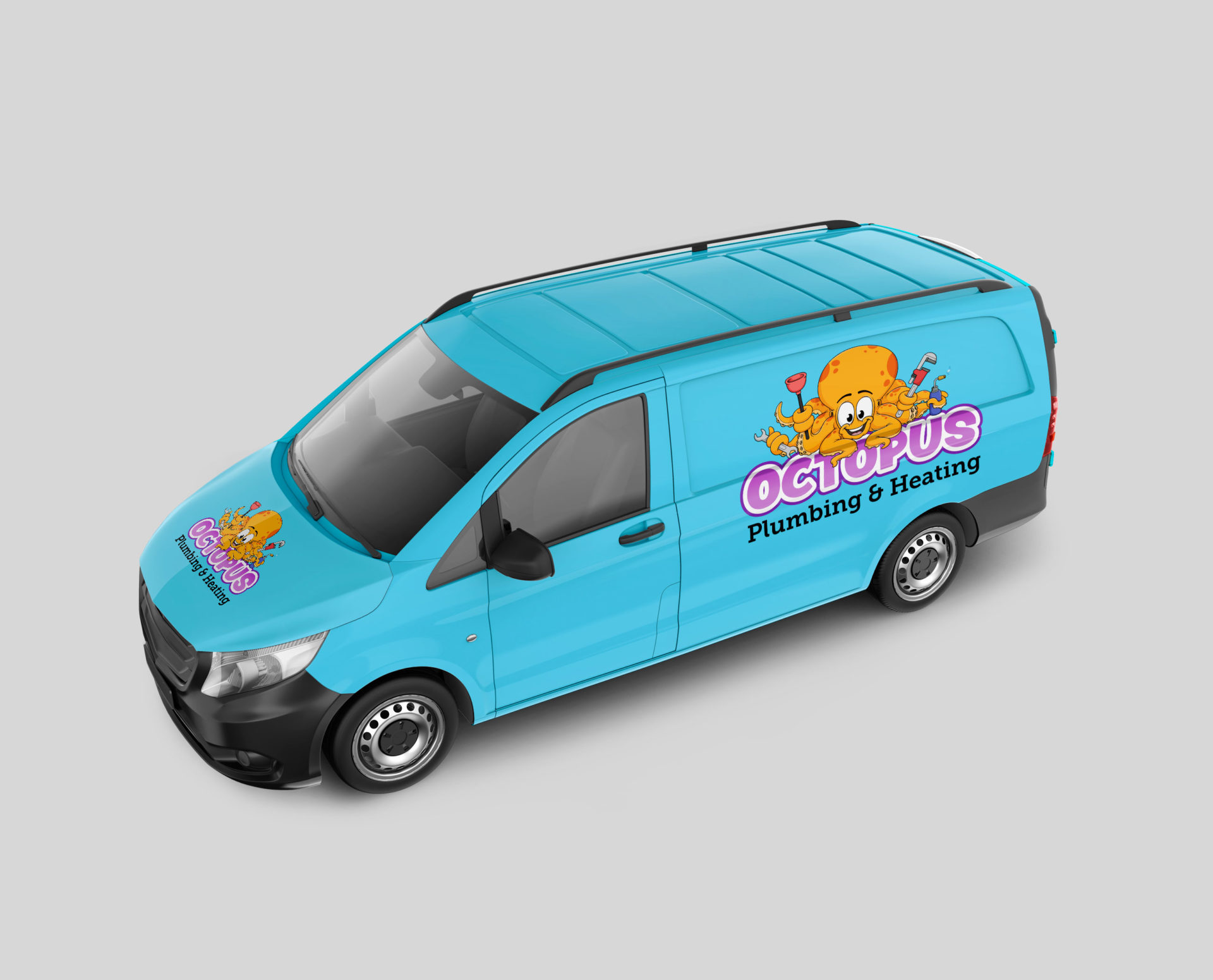
Once a refined version of the pencils were completed and approved by the client, it was time to transform the logo into a vector illustration. The advantage of creating this illustration as a vector is that it can be scaled to any size without any loss of quality. It will also remain crisp and sharp, whether the size of a postage stamp or as big as a house.
The chosen colours had to reflect a warmth and trust for the company, as well as working well on the side of a blue plumbing van. We supplied various colourways to the client, before settling on a strong orange tone.
Business cards were then created using the new logo and branding colours to give the client something really strong and memorable and stand out that bit more when placed alongside those of his competitors.
Related Projects

Our accreditations