Porton Biopharma
Exclusively producing the UK’s licensed anthrax vaccine on behalf of the UK government.
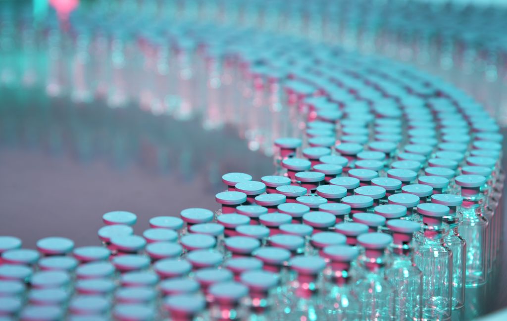
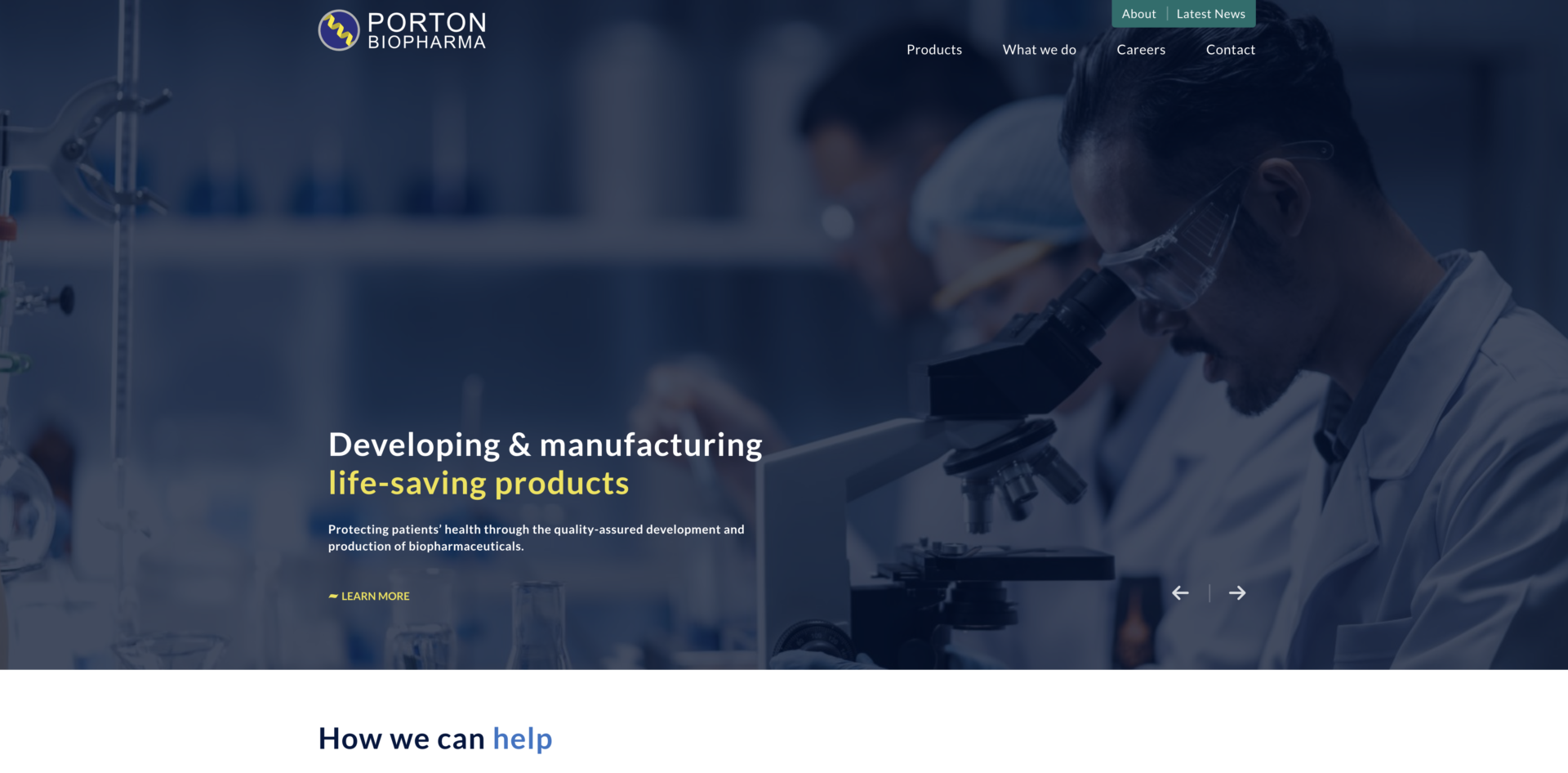
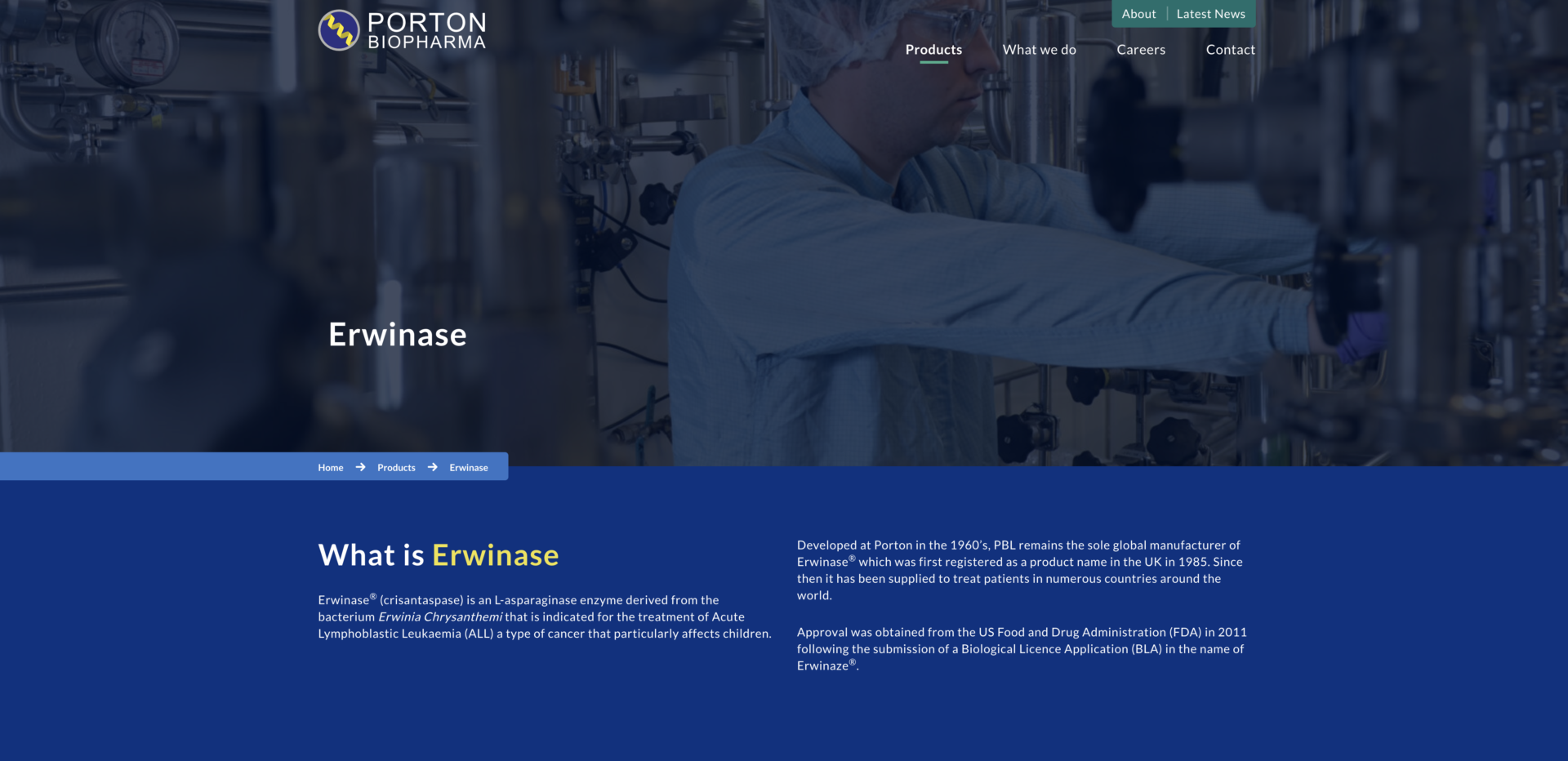
A renowned pharmaceutical company, Porton Biopharma are the sole manufacturer of a life-saving treatment for childhood cancer, Erwinase®. They also exclusively produce the UK’s licensed anthrax vaccine on behalf of the UK government.
After a company restructure accompanied by a new commercial focus, Porton Biopharma needed a website refresh to meet their corporate and recruitment needs.
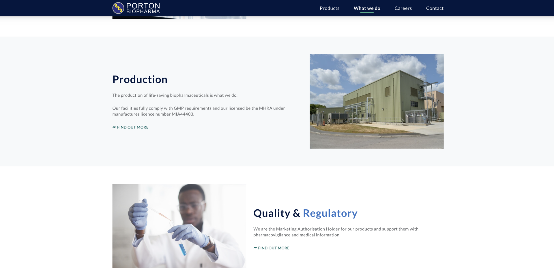
Porton Biopharma Website Overview
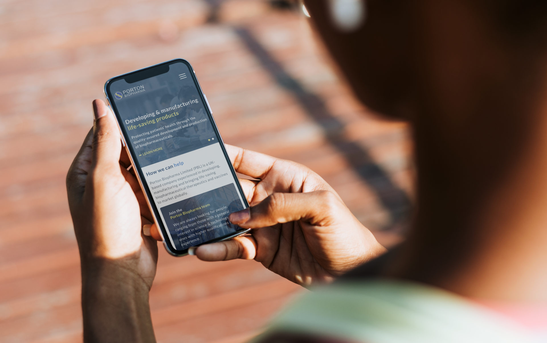
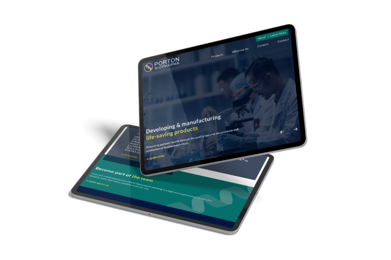
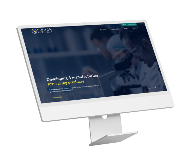
Porton Biopharma approached us for a new website that reflects their shift in company direction. To refresh their dated website, the client requested a new site with a sleek, professional design and bespoke functionality to improve the user experience.
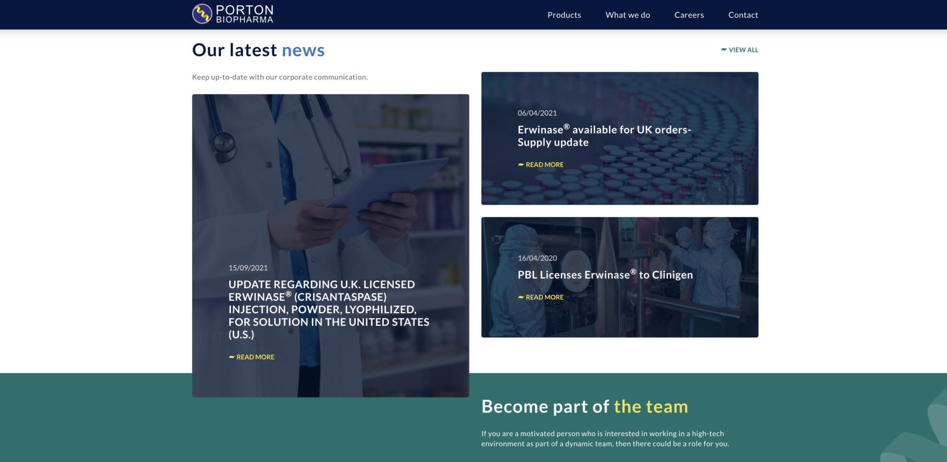
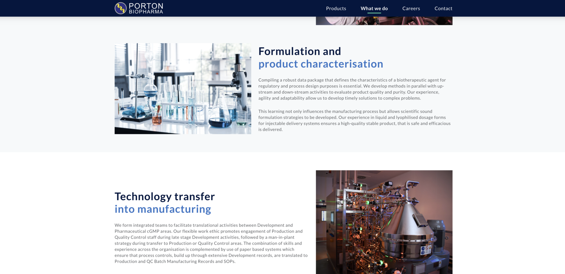
The new site needed to raise the company’s profile, serving to showcase all areas of the business and attract new talent.
Our work with Porton Biopharma is ongoing, with other projects including videography and graphic design work.
What we delivered
Our Approach
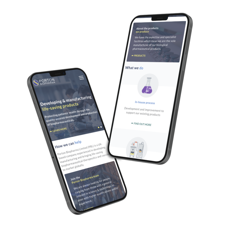
The new website needed to showcase Porton Biopharma’s career opportunities as much as their products. To take the recruitment website pages to the next level, we added bespoke functionality to make the pages easy to navigate for applicants and easy to manage for the client.
Intelligent web design
Our web development team built a filtering system into the career opportunities page, allowing potential applicants to find relevant jobs quickly. To make content management easy for Porton Biopharma’s HR team, the custom-built functionality allows them to create unique application forms, showcase featured jobs on the careers landing page and set automatic closure dates for different job opportunities.
Bold design to stand out from competitors
The client needed a website design that demonstrates their professionalism whilst adding some personality. As the previous website was cold and clinical, we incorporated curved corners, feature overlapping and stylised graphics to make the new site warm and welcoming.
The colour palette and font sizes were chosen for accessibility – which was vital for the client. The overall design appeals both to health professionals and patients whilst providing easily accessible legal information.
Website design
Related Projects

Our accreditations